
Branding / Brand Identity & Colors
Brand Identity & Colors
A logo is a start; a brand identity is the whole look. We give you a color palette and fonts that work together, so your site, cards, and signage all feel like one confident company.
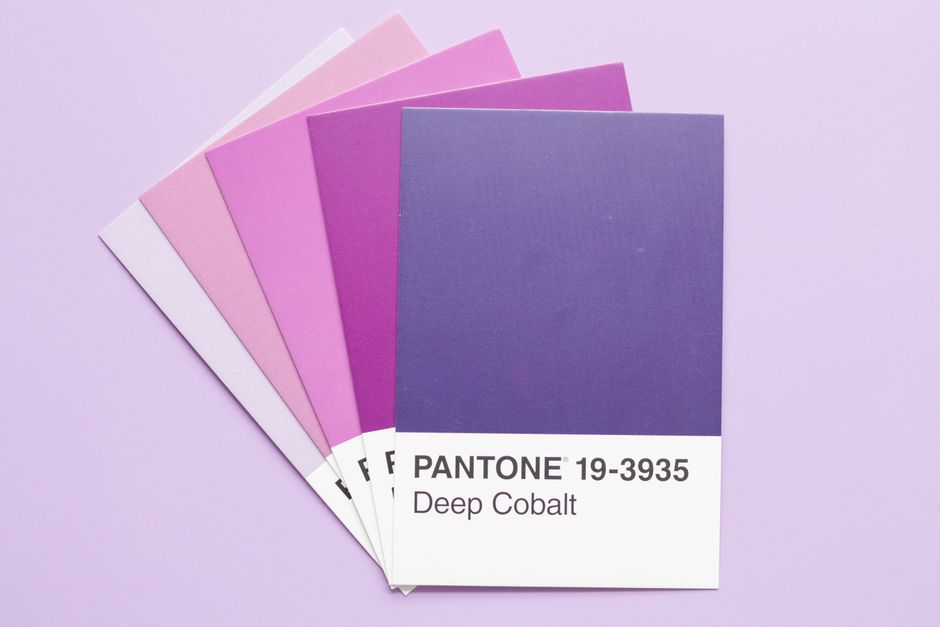
Photo by Fiona Murray on Pexels
What it is
A consistent look that ties everything together.
Brand identity is the set of colors, fonts, and visual style that go with your logo. It is what makes everything you put out instantly recognizable as you.
In plain terms
Think of a team uniform. When everyone wears the same colors, they read as one team. When your site, truck, and cards all match, customers instantly recognize you as one established company.
Instant recognition
A consistent look makes people remember you.
Look bigger
A cohesive identity makes you feel like an established company.
Easier to create
Set colors and fonts make every future material simple.
Why consistency does the heavy lifting
Recognition is repetition. A customer sees your yard sign on their street, your truck at the supply house, your card on a fridge, your website after a referral — and if all four match, four exposures compound into 'I know this company.' If each looks different, they register as four strangers, and the marketing money behind every one of them is quietly diluted. Big companies obsess over this for a reason; for a local trade, the effect is the same at smaller scale.
Color and type also talk before your words do. Navy and steel read as established and careful; a random mix of bright defaults reads as improvised. Neither is 'prettier' — one just matches what a homeowner wants to feel about the person rewiring their house.
What you actually receive, and how you use it
The deliverable is concrete: a small palette — usually a dominant color, a supporting neutral, and an accent — specified in the exact codes every medium needs (hex for web, CMYK for print), plus one or two fonts chosen to pair well and stay legible on an estimate as much as a banner. Practical rules come with it: what goes on dark backgrounds, what the accent is for, what to avoid.
Then it stops being a decision. The next time you order anything — shirts, signs, a trailer wrap, social graphics — you copy the codes from one page instead of eyeballing 'that blue, more or less.' Vendors get exact values, materials come back matching, and everything you have ever put your name on starts pulling in the same direction. It is the least glamorous part of branding and the part that pays most often.
Sound familiar?
Signs this is for you
If any of these ring true, this is exactly what fixes it.
Your website, cards, and signs all use different colors and fonts.
Nothing you put out feels like it belongs to the same business.
You pick a random color every time you make something new.
How it works
Simple, start to finish
Define
We choose colors and fonts that fit your trade and feel.
Pair
We make sure they work together and read clearly everywhere.
Document
We give you the exact codes so it stays consistent.
See the difference
Before and after
A blue logo, a green website, and orange business cards. It all feels like different businesses.
One set of colors and fonts across everything, so you instantly look like one solid company.
What you get
What is included
A color palette that works across web and print
Fonts that pair well and read clearly
A consistent visual style to follow
Guidance on using it across materials
A look that feels like one company, everywhere
Why it matters
Why this is worth doing
Inconsistent colors and fonts make a business feel scattered and smaller than it is. A consistent identity makes you look established and builds recognition every time someone sees you.
What it costs
Pricing, plainly
Brand identity is usually scoped together with a logo — the palette and fonts are designed around the mark — and quoted fixed upfront. Building a site with us? We define the working palette and type as part of the design, and a formal identity document is a small add-on.
FAQ
Brand Identity & Colors: common questions
A logo is the single mark. A brand identity is the full look around it: colors, fonts, and style that make everything you put out recognizable as you. The two work together.
Let's talk
Ready for a website that brings you work?
Tell us about your business and we'll send back a free, no-pressure review of your current site (or a plan for a new one). We reply within 1 business day.
Lancaster County, PA. Working with contractors across Pennsylvania.